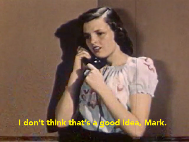
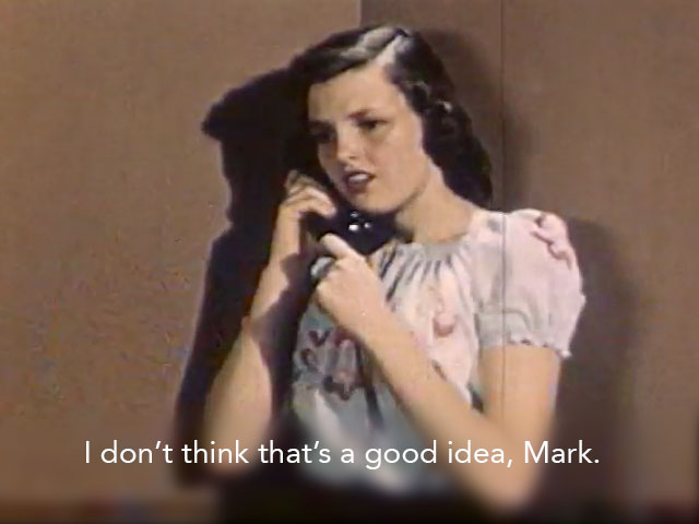
The subtitles in the image above aren’t very easy to read at all. This is a common problem and it almost always occurs because the background (whatever the subtitles are being laid on top of) is too close to the subtitles itself, making the text difficult for our eyes to distinguish. With light colored subtitles, light colored backgrounds can be especially difficult. Similarly, if you have a particularly busy background with lots of small details, it can be difficult to read subtitles too.
Many of these subtitling tricks can be done in just about any video program, so the software you’re using isn’t as important as the style you use with which to apply the subtitles. Without further ado, here are 10 ways to make subtitles more easily readable.
1. Give the text a thin outline or stroke
Many video editing programs provide you with the ability to add a stroke or outline to text. In this case we’ve added a 2 pixel black stroke around our text, making it more legible. Pros: Makes the text more legible no matter what your background is or how bright it is. Cons: Depending on how thick your font is, your stroke may look chunky or ugly.
2. Make the subtitle text bold
This is one of the easiest changes you can make to try and make subtitle text more legible. By making the subtitle font (in this case Avenir 28 point) bold, you can often easily make your subtitles more readable. Depending on the background, this may not be enough to do the trick however.
3. Change the color of your subtitles
White is a fairly common color in video and in life so it’s not surprising that light colored backgrounds often make white subtitles hard to read. Often changing your subtitle color to yellow (another common sub color) is enough to do the trick. We recommend playing around with this.
4. Add a subtle drop shadow

Adding a slight drop shadow on your subtitle text can be less chunky or ugly looking than an outline or stroke, but it can achieve the same result in increasing legibility. If your subtitle drop shadows are too far away from the text, or they’re too hard, it can make the subtitles less readable however. Here’s an example with subtitle outlines that are too far away from the text to make a positive difference:

Making hard subtitles that are closer to your text can have a good effect on legibility however, as in this example:
5. Add a darkened box around your subs
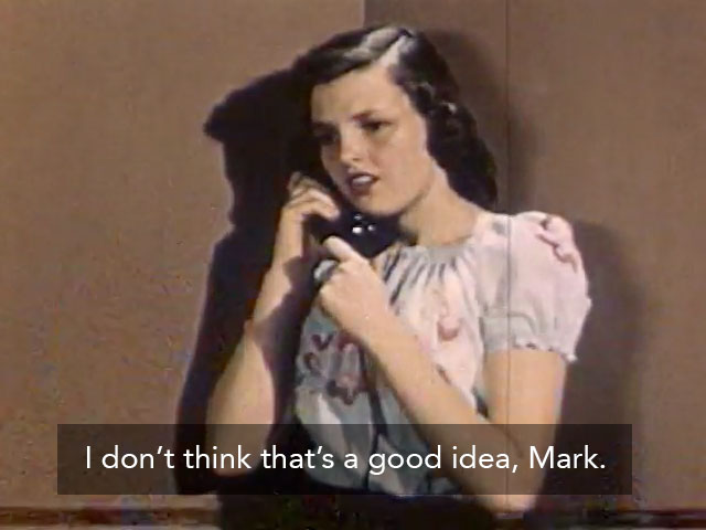
You may have seen this approach on Netflix or YouTube’s closed captions. Adding a dark box of approximately 50 percent opacity can make your light colored subtitles pop out and suddenly become more readable. One possible drawback of this approach is that if your editing/subtitling software doesn’t have this feature built in, it can be tedious to add the correct sized boxes to each subtitle– especially if you have a lot of them.
6. Add a background stripe to your subtitles
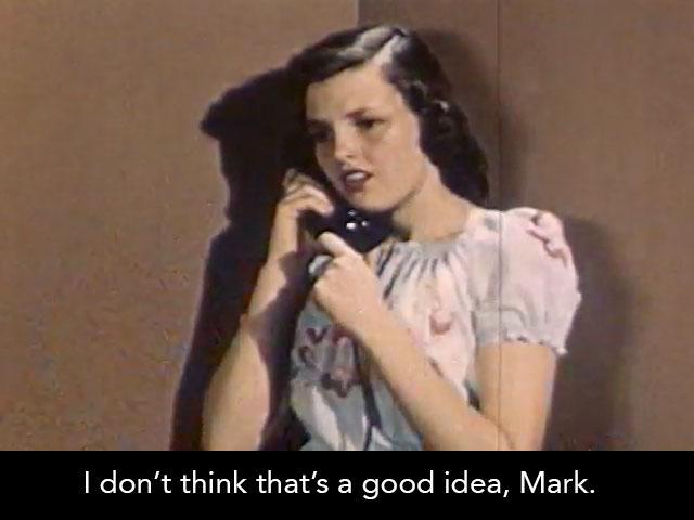
Sometimes video editors choose to add a dark stripe to the bottom of their video (either letterboxing it or laying it over the existing video) and then they put their subtitles on top of that to ensure legibility. Besides aesthetic concerns, you may want to be careful about the title safe area of the screens that may display your content to make sure your subs won’t be cut off. For instance we would caution against this method if you plan to display your work on televisions.
7. Blur the background behind your subtitles
If your video editing software allows you to selectively apply a blur to your video, this approach can work.
8. Change the location of your subtitles
In some cases subtitles may be difficult to place at the bottom of the screen, usually because there is other important information for the viewer to be able to see down there. For instance there may be some important activity down there or lower third (chyron) titles identifying people’s names. In the example above instead of using a subtitle, we’re using a supertitle which sits at the top of the screen.
9. Darken the entire video so your white subtitles are more readable
For the example above, we’ve darkened all but the left-most sixth of the screen (so you can see the difference it makes). If you darken the video in a subtle way your viewer will probably not notice it’s not as bright as it might otherwise be, and your subtitles will pop out at the viewer.
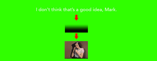
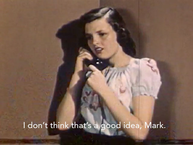
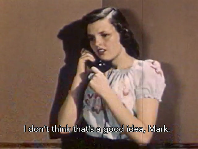
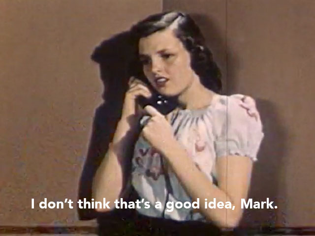
10. Give your subtitle area a subtle gradient background
In this example we’re using a very subtle dark color gradient underneath the subtitle on top of the video. Basically if you were to imagine your video as a sandwich, the top layer would be your subtitle text. Underneath that is your subtle gradient which only overlays on the bottom of the screen where your subtitles are. Finally on the bottom video track is your video itself. Take a look at this diagram for more of an explanation:

When done subtly, this effect is often virtually impossible for the casual viewer to notice– all they notice is that your subtitles are clear and easy to ready. If you’d like to use a similar subtle gradient as the one we’re using in this example, download this 1920 x 1080 subtitle gradient here as a PNG file with transparency.
In summary
With more and more web videos getting subtitled– partially to make Facebook and twitter videos understandable without sound, as more and more viewers are starting to watch videos without sound.
Generally speaking in order to make subtitles more readable, you either need to change the subtitles or change the background of what they’re on top of. Choosing a font that isn’t too thin is part of the struggle, as well as a color that will stand out from the background. When that doesn’t work, it’s time to experiment with changing the background, either by adding an overlay of some sort or adjusting it in a different way.
Related:
How to Easily Add Subtitles/Closed Captions to Video Using Adobe Premiere Pro
